Let’s get straight to the point. If you make training materials, you need to use Canva. Learning and development professionals know the importance of good-looking visuals like icons, images, logos, lists, and videos.
It used to take hours to make things that looked great. In my case, I went to art school to learn how to create visuals using the Adobe Creative Suite. Now, I barely open Photoshop, Illustrator, or Premiere Pro.
Yes, I’ll take the hate from the graphic designers. I’ll shoulder the pain of the pure artists raging at their Wacom tablet and watercolors over this introduction.
This One’s for You
For those of you out there trying to do three or four people’s jobs for one salary, this post is for you. If you run your own freelance business or need to control your branding but you can’t hire a graphic designer, this post is for you. And, for those of you who just generally love to make awesome-looking visuals and only want to pay $120 a year for the pro version of Canva, then this post is for you. (There is a free version, but serious Instructional Design professionals won’t be able to live without the features you get in the Pro version.)
So let’s get to it. Four Reasons Why I Love Canva (Even Though I Went to Art School).
Brand Kit
I create a lot of content for my clients and I need a way to keep all of their branding assets organized. Of course, I create an asset library for every customer full of PDFs of brand guides, images, and guidelines. My folder structure is a great storage system, but Canva’s Brand Kit makes it super easy to make things without the need to access the basic brand info while making stuff.

Inside the brand kit, you can create a custom color palette as well as upload company logos and fonts. This level of customization allows me to create materials in a snap.
Background Remover
One feature I used a lot in Adobe Photoshop was cutting out an image from its background. In video or in an eLearning course, you need to be able to use an image without the background to draw focus to the singular object.
Canva makes this super simple with Background Remover in their Effects panel. All you need to do is drop an image on the workspace. Give it a moment to load, then select Effects. Choose and  abra-ka-pocus! The background is gone!
I use this feature a couple of times a week to make thumbnails, images for videos, and course materials.
Templates
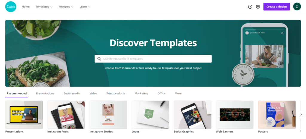
Rapid development requires agile processes. Wasting time creating artifacts from scratch is not only inefficient, but it also costs your business money. Canva’s templates are easy to customize and allow you to create a consistent look and feel to your content.
I find inspiration in the presentation, logo, and graphics templates. Templates are the perfect exemplars to jump off into the creative design process. The speed of the creative process is doubled if not tripled because of the ever-expanding template library.

Usability
Here’s the deal. I spent years mastering the Adobe Creative Cloud applications yet every time they update the software, I feel like I’m starting over again. Also, the menus and features from one program to the next do not align with each other.
With Canva, I’m able to create dope-looking images and logos within seconds. I’m able to export into a variety of formats. And, everything I need to do the work is located in an intuitive cloud-based, graphic interface.
If you are thinking, well now Chris, hold on! You have an art degree so you know how to make the templates work for you. While it is true that the creator is more important than the tool, let me offer this: I’ve onboarded 4 clients with no graphic experience to Canva and they LOVE it!
Summary
If you ever make visual assets and are not already using Canva, you are missing out. The Brand Kit feature allows you to save custom color palettes, logos, and fonts to keep your materials looking consistent. The Background Remover tool is like having a magic wand to gut out individual objects from the larger picture – a feature I use all the time. Templates are excellent for inspiration, whether you’re creating a presentation or social media post. They have it all and they’re incredibly easy to play with and customize. In terms of usability, don’t sweat it. You don’t have to be an art school major to make nice things.
So what are you waiting for? A plethora of visual possibilities await!
Helpful Links
Why Hire an Instructional Designer? – VIDEO
How Important is Visual Design in Learning Videos?
How to design an off-the-shelf eLearning course to become a custom eLearning course
Join my learning pals
Do you use Canva or another graphic design tool?
Have any tips? Share them in the comments.
Did you like what you read? Join my learning pals. Please subscribe to my newsletter to receive free learning resources delivered to your inbox every two weeks.
THE END


